Combining the ideas behind Dave Shea's CSS Sprites with Douglas Bowman's Sliding Doors.
A while back Douglas Bowman wowed Alistapart readers with his excellent article Sliding Doors of CSS, describing a new and revolutionary way to build a tabbed menu interface using CSS. Shortly thereafter, Dave Shea came along with CSS Sprites: Image Slicing’s Kiss of Death. In the article, Dave outlines a method of using a 'master image' made up of smaller images that are used for presentation within a site, and displaying these images as needed by positioning them via the 'background-position' property.
Being a fan of making files smaller and sites faster, I decided to see if the two methods could be mixed, and sure enough, they can.
Notes: 1. The remainder of this post will assume that you have a good understanding of the two articles outlined above, especially the Sliding Doors article. 2. This has been tested in Firefox 0.9, Opera 7.50 and the Win Triplets on WinXP.
Getting started
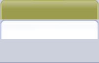
Before we get into this, here's the final product with the CSS in the source.
The Sliding Door method requires three images, one for each side of the door, and one for the background of the <ul> that provides the bottom line for the inactive tabs.
So the first thing that needs to be done is to determine how to lay out the master image so as to make it possible to use the images as needed. As it turns out, the only requirement in this case is that the underline used in the <ul> element is at the bottom of the master image (see the dark blue line here at the bottom of the master image that we will be using). This is so that we can set the vertical position of that background image to 'bottom', ensuring that that line will stay put at the bottom of the <ul> if the tabs are resized.
The tabs themselves need only be wide enough for your application. Notice in the master image that there is some vertical space left between the blue horizontal line at the bottom and the tabs; that is necessary as that empty blue space above the line acts as the background for the tabs.
Position your image
Now it's time to put our images into our css. For this, have a look at the demo page and view source to see the CSS. If you were to compare this CSS with the original article, you would see that the changes are minimal.
Bottom line
First thing, have look at #nav. Notice there that the image is repeated in the x direction, and positioned to the left and the bottom. By doing this, we sit that dark blue line at the bottom of the #nav container. This line acts as the divider between the tabs and our content.
Left and right doors
Now have a look at #nav a, #nav strong, #nav span. There you can see that the background image is set to no-repeat 100% 0px. What that is doing is setting up the right door by telling the image to sit it's right edge against the right edge of it's container.
The same is done for the left door in the #nav li element. There the left door is set up by having the image sit it's left edge against the left edge of it's container.
Current Tab
This next part we do the same as above, but we set the top of the image to -41 pixels (the top of the white tab in the image) setting 0 -41px for the left door and 100% -41px for the right door.
Beleive or not, that is it!
Is it worth it?
Good question. Though the images in the article are different from the ones used here, it's worth mentioning that those images weighed in at 3815 bytes while the single image used here weighed in at 1887 bytes.
More importantly though, the number of requests is lower using the single image and wasted paket space is reduced. The 'left' images from the article and the underline image are each under 400 bytes. With packets running at 1400 bytes, that's roughly 1k of wasted space per image that is eliminated by combining images (see more about combining images and packet sizes in CSS Sprites, Background Images and Website Optimization).
Taking it further
This is a good example of combining images to help speed up your website, but there's no need to stop here. Other images used in the site could be combined here as well, provided the file compresses decently, so be sure and keep your eyes open for other candidates for your master image.
Comments and Feedback
Great! (Somehow I feel like this article should be on ALA, too...) ;)
About the only problem is that it breaks when you increase the font size.
Thanks MaThIbUs!
James, from the testing that I have done, yes it does break in some extreme cases, however this can be dealt with simply by creating a larger (wider) image for the tabs and leaving more space above the underline.
This is most certainly a case by case basis. In this case I left it like this mostly to show this very point - if you\'re not careful with your image size, it can break at larger font sizes - try \'largest\' in internet explorer or 180% in Opera, for example.
So the solution is to make your tabs taller and wider as necessary. There will still be a benefit from combining images as you will be reducing requests and likely not waste as much packet space.
Funny... I had done the same a few weeks back on my portfolio site. It works fine across the board, with one problem: it was not possible to use transparency (like behind the top corners in your sample). As for the file size, ymmv, depending on shapes and colours. The plus point is reduced number of requests, and ease of management (no slices ! which is always a pain in the).
P.s. — your sample breaks at 150% on most Mac browsers
Thanks for the feedback, Philippe. I\'m going to leave the breaking image in there to keep people on their toes ;-]
That property site we did has 35 requests on the home page - brutal. I can\'t wait for the redesign!
Hey, your portfolio site is looking pretty guay!
Hi Mike:
Nice implementation. I also noticed the size breaking the nav bar, but as you say this can easily be fixed by making the artwork wider.
However, I also have an issue with the current tab being a link. I believe it is bad practice to have a link that points to the current page.
I imagine all that needs to be changed is for the style for \"#nav #current a\" to be changed to \"#nav #current\" (I haven\'t tested it).
Nice work - will definitely add it to my toolbox.
Thanks Fred, one thing though,
#nav #currentholds the left side of the tab, so you would likely have to add a hook in there to hold the right side if you remove the anchor (whose job it is to hold the right side). Perhaps a<strong>would work, both as a hook and for bolding the current tab.Re [5 ] - arigato Mike; One day I\'ll put that thing in English as well... one day.
I was thinking - that whole tab effect could be improved with some neat :hover effect. Mmmh, that will require some javascript as well, if one cares about IE li:focus, li:hover won\'t do there. Maybe Sons of Suckerfish can help. Maybe later I\'ll try
You\'re right, some hover effects would be nice (must have a peek at yours!). For now I love the simplicity of it all. One problem I am having though, is floating the whole thing right...
Here. Right floated tabs, a first draft. This works fine in Firefox, Opera7.5 and Safari. IE mac needs some fine tuning. Untested in IE win.
Code is a mess, I just picked up a file from previous unrelated experiments.
Wow Philippe, nice. I\'ll have to dig into that, \'cause right now I\'m using a fixed font size, setting a width on the UL, and floating it right inside a wider container.
Yours looks nice, and the internal bits are still floated left, so no \'list inversion\' is happening... interesting... Thanks!
The same technique (multiple images in one file) works well when you need many small images (icons) on one page. Use DIVs instead of the IMG tag and assign proper part of the image with background-position rule.
Here is an example (grid widget at the bottom of the page).
Great example, Mike. Reminds me a bit of Didier Hilhorst\'s Navigation Matrix
Hey Minz, Thanks. I was originally going to use Didier\'s example to build this navigation, but I was curious to try the sliding doors method with a single image. The three image method set up in 5 minutes, quite easy overall really; Doug wrote a great article. From there the hardest part was building the single image!
How would you create more spacing between each tab, so that they aren't so close to the one next to them?
Update: I eventually found it - I added left and right margins to the #nav li
Is anybody else seeing this entry always come up as unread in their RSS reader every time it updates? It’s strange…
Chris, this happens to me with many blogs, not sure why but it seems that when the page structure is tweaked, the readers see it as updated. This doesn't seem right though... Maybe I should dig into this a bit? Looking at my RSS file, I see no time for 'last updated', so I'm not sure how it sees this as 'unread'.
I have a variation on the sliding doors idea on my site.
Fitted doors using images
Fitted doors - no images
These are just for CSS demonstration and may have accessibility issues.